UX Research & Design

Patagonia Website Analysis

An in-depth evaluation of Patagonia's digital experience, exploring how effectively the website supports user goals, communicates its mission, and guides users through key tasks.

Duration 16 Weeks
Team 4 Students
My Role Team Lead + Writer/Editor

Overview

Patagonia is an outdoor clothing and gear company known for its environmental activism, sustainability, and commitment to responsible business practices.

For this project, our team conducted an in-depth analysis of Patagonia's website to evaluate how effectively the digital experience supports users while communicating the brand's mission and values.

My Role

  • Led the team throughout the research process
  • Wrote and edited research findings and documentation
  • Contributed to usability testing and interviews
  • Helped synthesize findings into recommendations
Patagonia outdoor adventure in a mountain landscape

Research Goal

We identified the primary goals users bring to Patagonia's website and assessed how effectively the site supports those goals.

Based on this evaluation, we developed clear, actionable recommendations to help Patagonia better meet user needs and strengthen its digital experience.

Methods

We used a combination of evaluative and analytical user research methods to understand how Patagonia's website performs. Each method revealed a different layer of the user experience.

Heuristic Analysis

Identified usability violations by evaluating the website against established usability principles.

Competitive UX Research

Compared Patagonia's digital experience with similar brands to identify patterns, strengths, and opportunities.

Usability Testing

Observed users completing key goals and tasks to identify areas of success and friction.

In-depth Interviews

Gathered insights into users' motivations, attitudes, expectations, and behaviors.

AI-aided Analysis, Personas, Empathy Maps, Journey Maps

Used personas, empathy maps, and journey maps to synthesize research findings and better understand users.

Card Sorts (Tree Tests and First-click Tests)

Used tree tests and first-click tests to explore the site's navigation and information architecture.

Heuristic Analysis

A heuristic analysis is an efficient way to identify usability issues early in a project by comparing a website's features against established usability principles. We began with this method because it allowed us to quickly uncover core issues before moving on to more time-intensive methods like usability testing.

We analyzed the pages users would navigate through to complete five key goals: learning about Patagonia's community involvement, environmental campaigns, and mission, as well as browsing and purchasing products.

As we reviewed the site, we documented heuristic violations in a shared Google Slides presentation. I was responsible for writing descriptions explaining how Patagonia violated each heuristic, while another teammate gathered supporting image examples.

View the presentation below!

Competitive UX Research

Using our key heuristic findings, we conducted a competitive analysis to see how Patagonia compares to similar brands. This helped us identify where Patagonia's website falls short compared to its closest competitors and highlighted design strategies that are working well elsewhere, so this information could be applied to our future recommendations.

We first identified five brands similar in either products or messaging to Patagonia. The brands we selected were:

North Face Columbia LL Bean Carhartt National Geographic

Each of us selected one website to analyze and rate, and then we compiled our primary findings in a shared Google Sheet document, allowing everyone to view and compare each other's insights.

Key Insights

Areas for Improvement

  • Home Page Aesthetics
  • Use of Personal Stories

Areas of Success

  • Encouraging Product Purchases

Identifying these patterns helped me better understand what makes a website effective and user-friendly, while also showing how those insights could be applied to Patagonia's site. Comparing Patagonia to other brands highlighted areas for improvement and gave our team clearer direction on what usability issues to explore further during usability testing.

Usability Testing

Usability testing was one of the most valuable yet challenging parts of the project. By observing users complete tasks on the website, we were able to identify areas where they became confused or frustrated.

Our team defined our user group as people who had shopped at Patagonia or similar brands, were active and outdoorsy, or cared about sustainability. Each team member selected one participant who fit at least one of these criteria. My participant was active and outdoorsy but unfamiliar with Patagonia, which provided insight into how new users navigated the site.

To prepare, we developed five user scenarios based on our goals and created a usability testing script. After practicing with classmates, we revised scenarios that were too leading and learned how to guide participants without directly helping them. This was difficult for me at first because I naturally wanted to reassure and assist frustrated users, but I improved by staying patient, offering gentle encouragement, and allowing participants to think through tasks independently.

During my official session, my participant became stuck on the tutorial and repeatedly asked for help, which made the session challenging. This experience taught me patience, adaptability, and the importance of remaining calm and supportive while keeping the test focused.

Usability Testing Results

We collected data by tallying each time our users:

  • Took a wrong turn
  • Required prompting to either repeat the question or guide them on where to go
  • Complete failure of the task

In-depth Interviews

In-depth interviews perfectly complemented our usability testing because they helped us understand the motivations, wants, and needs behind users' behaviors. While usability testing showed us where users struggled, interviews helped us understand why they made certain decisions and what they value when interacting with a brand like Patagonia.

Each member of our group interviewed one participant who matched Patagonia's ideal customer: someone who shops online frequently, is active, and cares deeply about sustainability. Not all of our interviewees met all three criteria, but each participant matched at least two, making their perspectives relevant to our study.

Our questions focused primarily on sustainability and website navigation, the two main issues we had identified with Patagonia's site so far. We wanted to explore these issues further and determine whether users viewed the problems we identified as meaningful barriers to their experience.

After completing our interviews, we coded the responses for recurring insights and notable quotes. We then compared our findings as a group to identify common themes across participants.

What We Wanted to Understand

We were especially interested in whether users' perceptions of Patagonia's sustainability messaging matched their expectations for transparency, authenticity, and ease of making sustainable choices.

Situation barriers limit sustainable behaviors

Participants expressed that wanting to make sustainable choices does not always translate into sustainable behavior. Factors such as convenience, accessibility, price, and the situation a person is in can make it more difficult to act on their sustainability values.

Brand image is more trustworthy than specific knowledge

Participants often associated Patagonia with sustainability and trusted the brand's overall reputation, even when they could not identify specific details about its environmental practices. This suggested that Patagonia's established brand image plays an important role in shaping users' perceptions of the company.

Authentic sustainability requires transparency beyond marketing

Participants valued sustainability messaging, but their trust depended on seeing evidence behind a brand's claims. This highlighted the importance of providing clear, accessible information about how products are made and what the company is actually doing to support its environmental commitments.

Repetition reinforces sustainability messaging

Repeated exposure to sustainability information can strengthen users' association between Patagonia and environmental responsibility. However, messaging needs to remain meaningful and informative rather than feeling repetitive or purely promotional.

Connecting Interviews to Our Research

These findings helped us connect users' attitudes and motivations to the usability issues we had already identified. Our interviews showed that sustainability is an important part of Patagonia's brand identity, but users also expect that identity to be supported by transparency and actionable information. This gave us a better understanding of how Patagonia could strengthen its website experience by making sustainability information easier to find, understand, and trust.

AI-aided Analysis, Personas, Empathy Maps, Journey Maps

User personas, journey mapping, and empathy mapping are crucial to UX research because they transform extensive data from our interviews and user testing into something visual that is easier for the average viewer to understand and interpret. It makes it much simpler to quickly identify the motivations, pain points, and goals of users.

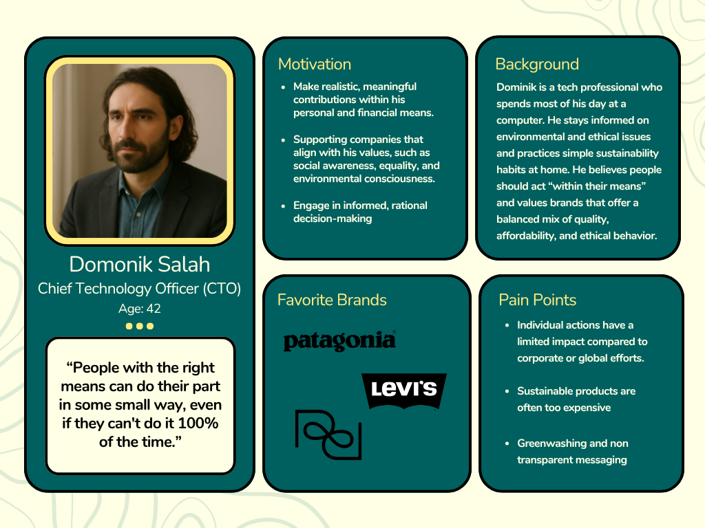
Our personas were created with two ideas in mind: we wanted one user to represent older user groups and one to represent younger. This is because in our interviews, we noted that older users tended to be less impulsive with their purchases and more heavily weighed the environmental impact, as well as cost and durability. Whereas younger groups tended to mostly weigh cost since they did not have the financial ability to consider sustainability as heavily.

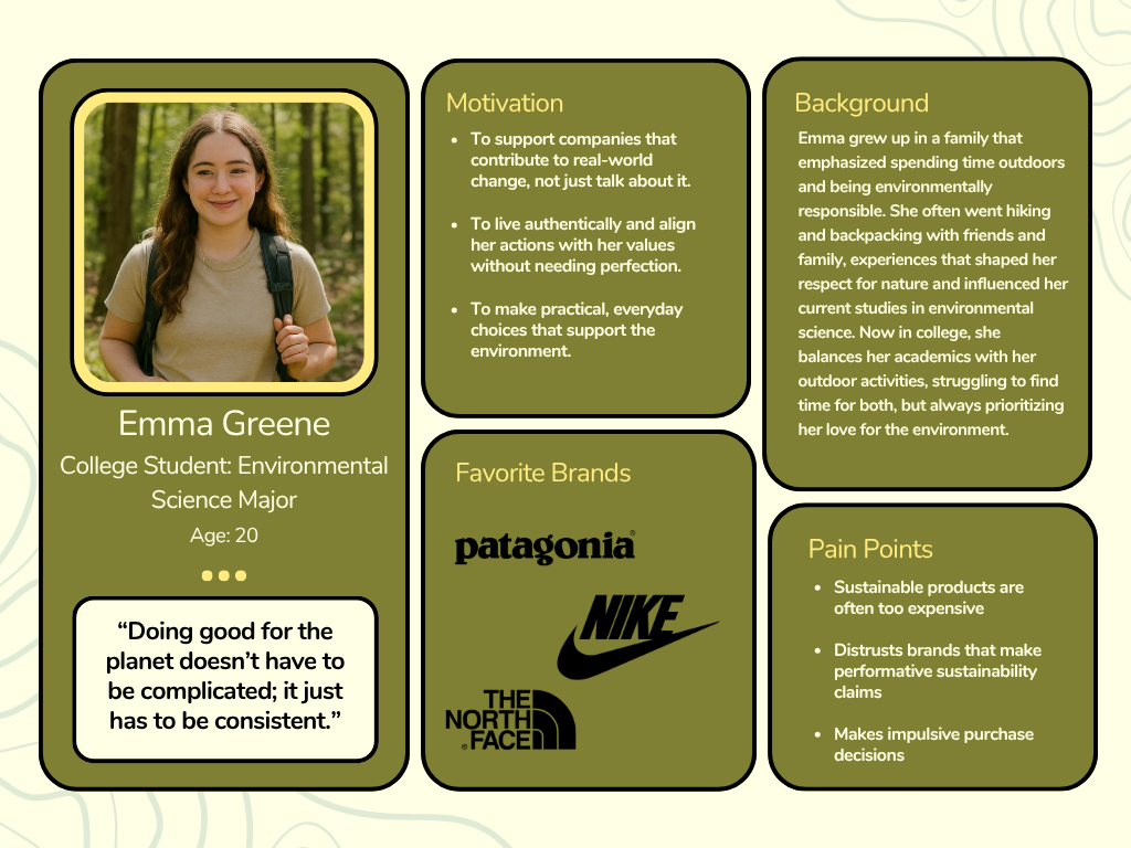
When creating these personas, we used the Forrester Persona Review Scorecard to dictate our choices in designing and creating these characters. To emphasize the most real, human-sounding persona, we decided to base these personas on our interviews. We used quotes directly from the interviews and our coding to determine the pain points and motivations of users. For our empathy maps, we took a lot of our insights from the persona's motivations and pain points to then find what they think, feel, do, and say.

Dominik user persona
Emma user persona

Thinks

Their underlying thoughts, emotions, and beliefs.

Feels

Their emotional state.

Does

Their actions and behaviors.

Says

Their direct statements and quotes.

These are taken from all of our interviews and are put together to create two independent user groups.

This information will guide our future recommendations for Patagonia by visually showing the motivations, thoughts, and beliefs of our users. This is crucial for considering a truly impactful and user-centered design.

Journey Mapping

We decided to narrow in on one user persona for our journey mapping since it can be quite a time-consuming process. Since Emma represents a larger part of our interviews and is part of the user group we studied more, we decided to analyze her journey.

Journey maps are particularly useful because they map out a user's step-by-step process of using an app/site and express their entire experience, including their emotions, thoughts, pain points, and opportunities. This is a bit different from our design persona and empathy maps, which focus more on the individual, rather than the individual within the experience.

Emma's Goal

Emma's goal for this journey was to: "Buy high-quality outdoor clothing, support brands that support her desire to lead a life based on sustainability standards, and not go broke doing so."

The above Miro board details her process of doing this task, and helps guide us to understanding our users' thought process when purchasing.

Conclusion

This project helped me better understand the relationship between user research, usability, and brand identity. Our team identified both the strengths and weaknesses of Patagonia's website and explored how the company's strong mission and environmental values influence the user experience. Patagonia positions itself as a company focused on activism, sustainability, and community involvement, which shaped many of the goals we created for our research.

One of my biggest takeaways from this project was learning how important it is to observe real users rather than relying on assumptions. Watching participants struggle, adapt, and explain their thought processes revealed usability issues that were not immediately obvious during our initial evaluations. It also strengthened my ability to remain patient, ask unbiased questions, and guide users without influencing their actions.

Overall, this experience sparked my interest in User Experience Research and gave me a deeper appreciation for the impact it has on creating effective, user-centered designs.

×